One of the great things about side projects is that you get to try on hats that you normally wouldn’t get to in your regular job. Like branding.
Building a product for yourself is a great excuse to unleash the frustrated designer / copywriter that lives inside all of us.
At the same time I know next to nothing about logo design or branding and being pre-revenue I wasn’t about to pay someone to design one for me.
Thankfully I found Marc Hemeon’s post on the “5 Minute Logo” and it gave me enough confidence to take a swing at doing the logo myself. And TBQF I’m pretty proud of the results.
So here goes.
Step 1: Choose a font
The latest project I’m working on is called brb.life. It’s a Slackbot that is all about helping people manage their out of office schedule on Slack, whether it’s booking in a holiday, taking an afternoon off or just working from home.
I wanted to create a brand that was fun to use — and a way to encourage more people to spend more time out of the office.
You will want to find a font which matches the branding, whatever you’re going for. Comic sans is more goofy than anything, Helvetica is pretty serious, something like Clarendon is maybe in between.
Whatever it is you want to try out a few fonts and see the fonts side by side so you can make a comparison. As per Marc’s suggestion I also tried uppercase and lower case to find the right solution.

Looking at all the options I felt like all caps was a little too aggressive and even camel case didn’t do it for me, so I ended up going with all lower case. Nice and low-key.
In terms of fonts I liked the cleanliness of Helvetica Neue but I also wanted to use something a little different so I ended up going with Roboto. Futura would have been a close second.
Fun fact: Roboto is Google’s choice for system font for Android.
Step 2. Find an icon
Now that we have a nice looking type face we can find an icon to go with it.
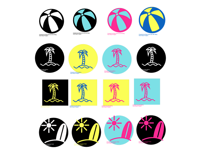
I was looking for something indicative of vacations so my first run at grabbing some icons looked like this:

Just go to NounProject.com and search for keywords to find some good options. My keywords were included holidays, vacation, beach, and tropical.
Step 3: Shapes and contrast
In Marc Hemeon’s process he takes a letter from the name of your product and puts it on a geometric shape to turn it into a logo. I wanted to see what that would do to the icons I found.

I’m actually pretty happy with how these options turned out and it gave me more options to consider. Again, it’s all about play and experimentation to find something that works for you.
Step 4: Add color
My knowledge of colour is pretty limited. There are really only two things I know:
- “Red and green should not be seen unless there’s something else between”
- Blue is a color of trust which is why you see it on so many bank websites
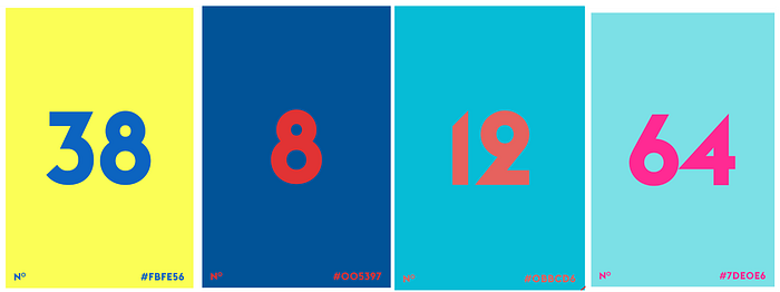
Trying to figure out some interesting colours that I could use for the branding that kept things fun was tough but Tobias Schneider’s “Color Claim” made it super easy to find some to at least experiment with.
I took screenshots of some of the ones that I liked and brought them into Sketch to experiment with.
I then threw these against my icon + shape combinations to see what took shape.
Finally I took some of my favourites and put the domain name against them again to see if that made it easier to choose an option for some reason.
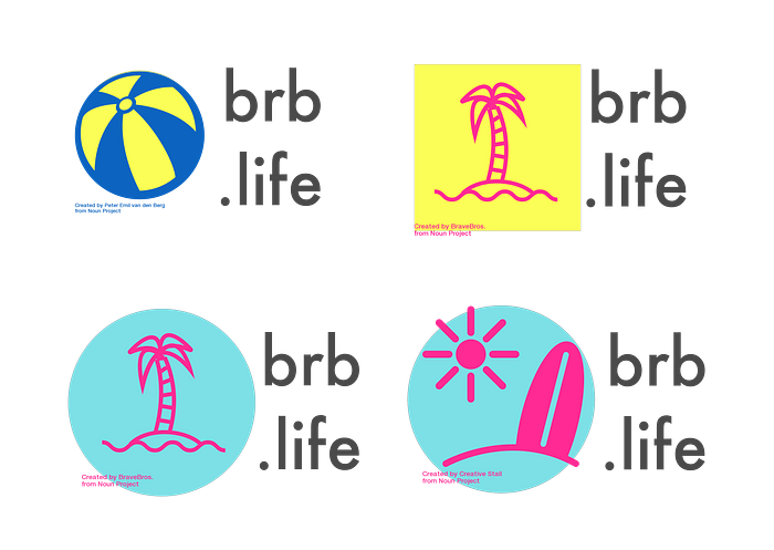
Step 5: Pick your favourite
Now that we’d cycled through all of these options I could take my pick on which set I wanted with a sense that I had explored all of the options.
And here it is:
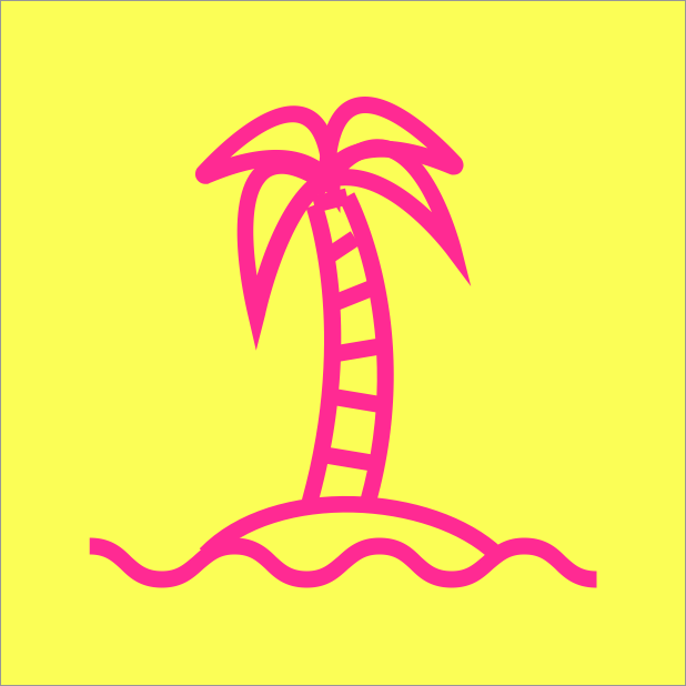
We ended up choosing this as our logo and I’ve got to say I’m pretty happy with it. Nice and simple yet bright and fun — and definitely not everyones cup of tea. I felt like it aligns with our branding and the idea that brb.life helps you enjoy life a little bit more by getting you out of the office.
I love it.
Conclusion
Getting a logo for a new project can be incredibly time intensive but it doesn’t need to be. You just need to get 80% of the way there through some quick and dirty experimentation.
I absolutely would pay a professional to do a more formal branding process if it was for something more than a side project. You get what you pay for.
Hopefully this post gives you some ideas and tactics to experiment with your own logo creation and find something for your next product.
While this post probably takes more than 5 minutes to read I can assure you that the actual logo creation took me no more than 5 minutes in Sketch once I’d grabbed my short list of icons.
And if you read this and get inspired to create your own logo I’d love to see it. Hit me on Twitter @nedwin.
Want to spend more time out of the office without letting your team down? Use brb.life to manage your out of office notifications on Slack.